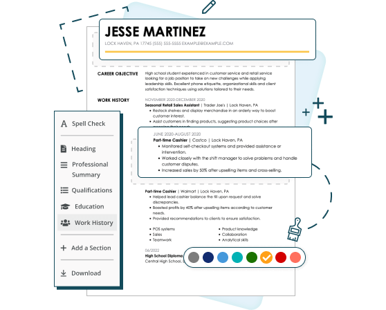
Want a stronger resume? Try our resume templates. Simply edit and download. Plus, you’ll get ready-made content to add with one click using our Resume Builder. Or view our sample resumes for inspiration.
1
The Best Fonts for a Resume
Your font choice can tip you into the interview or rejection pile, whether you like it or not. Think of all the jokes around playful fonts like Comic Sans or Papyrus. The font you choose for your resume sets the tone for professionalism and readability. We’ll explore the top fonts that balance modern style with clarity, ensuring your resume positively impacts hiring managers while remaining easy to read and visually appealing.
You can choose two types of fonts: serif and sans serif.
Serif fonts are characterized by small decorative strokes or lines (called “serifs”) attached to the ends of the letters. These fonts are often associated with a classic, formal and professional look, making them popular in print media like books and newspapers. Examples include Times New Roman, Georgia and Garamond.
Serif fonts are valued for their readability in longer texts and can be chosen for resumes to convey a sense of tradition and reliability.
The best fonts for a resume in the serif family include:
- Baskerville
- Bodoni
- Cambria
- Garamond
- Georgia
- Merriweather
- Playfair Display
- Times New Roman
Sans serif fonts lack the “serifs” found at the ends of letters in serif fonts. This gives them a clean, modern and minimalist appearance. Popular examples include Arial, Helvetica and Calibri.
These fonts are often used in digital formats and design contexts where clarity and simplicity are prioritized.
Sans serif fonts are a great choice for resumes and online applications, creating a sleek, contemporary look while maintaining readability,
The best sans serif fonts for your resume include:
- Arial
- Calibri
- Lato
- Helvetica
- Roboto
- Public Sans
- Verdana
- Trebuchet MS
Best font size for a resume
When typing your resume, keep the following resume layout rules in mind as you set your font size.
- Use the same uniform font size for the main body of your text. Depending on your font choice, set it between 10 and 12 points.
- Use a slightly larger font for your resume section headings. This can be between 14-16 points.
- Your first and last name should be the largest font size in your document. Set this between 20-24 points.
2
5 Resume Fonts in Detail
The best fonts for ATS resumes are modern and professional. Here are a few popular font choices, along with the pros and cons of each.
Arial
Pros: Arial is a sans serif that falls on the taller size. This design allows you to set a smaller font size without compromising readability.
Cons: Arial was one of the first default sans serif fonts, so it can seem overused and generic.
Georgia
Pros: Although Georgia is a serif font, its designers made the letters wide and round enough to be screen-friendly. This makes it an excellent choice for physical and online applications.
Cons: Although this font is found in Word and Google Docs, it may only be available in some word processors.
Verdana
Pros: Verdana is a thin, well-spaced sans serif that looks great in an 11-size font. The subtle spacing between letters helps reduce eye strain.
Cons: The default font size seems bigger than other fonts. This can take up more page space than expected unless you set a smaller font size.
Trebuchet MS
Pros: This sans serif font uses squat, round letters to make itself legible. Using a less common font can make you appear original and creative.
Cons: This font is Microsoft-created, although you can now find it in Google Docs. Other programs may substitute it with a similar free font and negatively reformat your resume sections.
Times New Roman
Pros: This well-known, traditional font exudes confidence and authority. Designed as a condensed font for newspapers, it allows you to fit more information onto a one-page resume.
Cons: Because Times New Roman is well-known, it can look overused and unoriginal. The compact design can also be dense and hard to read from a computer screen.
Font Styling: Italics and Bold
Our eyes naturally see and remember things that stand out. You can strategically use font treatments like bold and italic text to highlight specific information.
Use bold text on your section headings or job titles. This creates a natural break between resume sections so a hiring manager can easily spot these crucial sections.
Use italics for supporting text, like dates of employment or the city and state where you earned your college degree. Avoid underlining words because they can create visual static, making a section look busy and dense and too distracting to focus on the actual content.
Here is a resume work history example:
Film Electrician 2023-Present
Company City, State
For more specific resume section examples visit our how to write a resume objective and how to write resume skills guides.
Resume with italics and bold text
4
Key Takeaways
Choose an easy-to-read, professional font that makes the most of the limited time a recruiter might spare for your resume.
- Choosing the right font for your resume ensures it is professional, easy to read, and visually appealing.
- Serif fonts like Times New Roman and sans serif fonts like Calibri are excellent options for a clean, polished look.
- Use a font size between 10 and 12 points for body text to balance readability and content fit.
- Avoid overly decorative or hard-to-read fonts that might distract from your qualifications.
- Consistency in font style and size throughout your resume creates a cohesive and professional presentation.


